Designing a hub for all things 20%
Design and development of a portal to help Googlers manage all things 20% position related
The Product
20% Time is a portal for Googlers to manage and view everything related to 20% roles. At Google, 20% roles are part time positions designed to only take up 20% of your working time.
My Role
Lead UX Designer and researcher
Project Duration
Jul. 2024 - Dec. 2024
$305.63 billion (2023)
180,000+
Challenge
The primary challenge was to design an app that could seamlessly integrate multiple health tracking features without overwhelming the user. The app needed to provide valuable insights and reminders while maintaining an easy-to-use interface. Ensuring data accuracy and privacy were also critical concerns that needed to be addressed.
Results
The app launch was a resounding success, with over 10,000 downloads in the first month and an average user rating of 4.8 stars. Users reported a 60% increase in adherence to their health goals, thanks to the app's intuitive design and helpful features. The app also received positive reviews for its user-friendly interface and comprehensive tracking capabilities.
Responsibilities
Research & Analysis: We conducted user interviews, surveys, and analyzed in-app analytics to understand the pain points and user needs. We also studied the process managers would have to go about managing their 20% positions and how to cut down on how many sites/tools they had to use.
Information Architecture: Based on the research findings, we restructured the app's navigation and content, prioritizing features and information according to user needs.
Wireframing & Prototyping: We designed low-fidelity wireframes to visualize the new layout and navigation, iteratively refining them based on user feedback. Afterward, we built a high-fidelity, interactive prototype to test the design.
Usability Testing: We conducted usability tests with a diverse group of users to validate the design and identify areas for improvement. Based on the feedback, we made necessary adjustments to the design.
Visual Design & Style Guide: We used Google's cohesive visual language, including color schemes, typography, and iconography, ensuring consistency throughout the app. We also created some unique visual components to help us with our needs for the site.

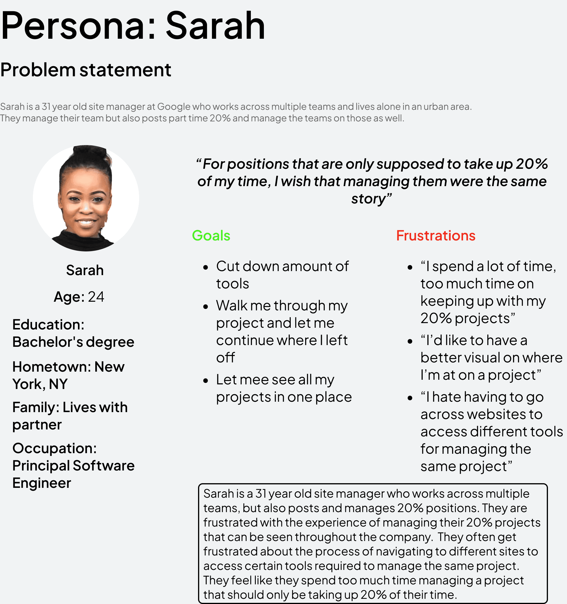
Understanding the User
Summary: I conducted user interviews, which I then turned into personas and empathy maps to better understand the target user and their needs. I discovered that many target users at times get overwhelmed and annoyed by how many tools were necessary in order to manage 20% roles. Many of the target users also didn’t have a very streamlined way of guiding a project from start to finish, our main goal is to find a way to simplify this for our target users in a way that requires less training and tools.
Pain Point 1: Based on the research findings, we restructured the app's navigation and content, prioritizing features and information according to user needs.
Pain Point 2: We designed low-fidelity wireframes to visualize the new layout and navigation, iteratively refining them based on user feedback. Afterward, we built a high-fidelity, interactive prototype to test the design.
Pain Point 3: We conducted usability tests with a diverse group of users to validate the design and identify areas for improvement. Based on the feedback, we made necessary adjustments to the design.
Pain Point 4: We used Google's cohesive visual language, including color schemes, typography, and iconography, ensuring consistency throughout the app. We also created some unique visual components to help us with our needs for the site.
Starting the Design
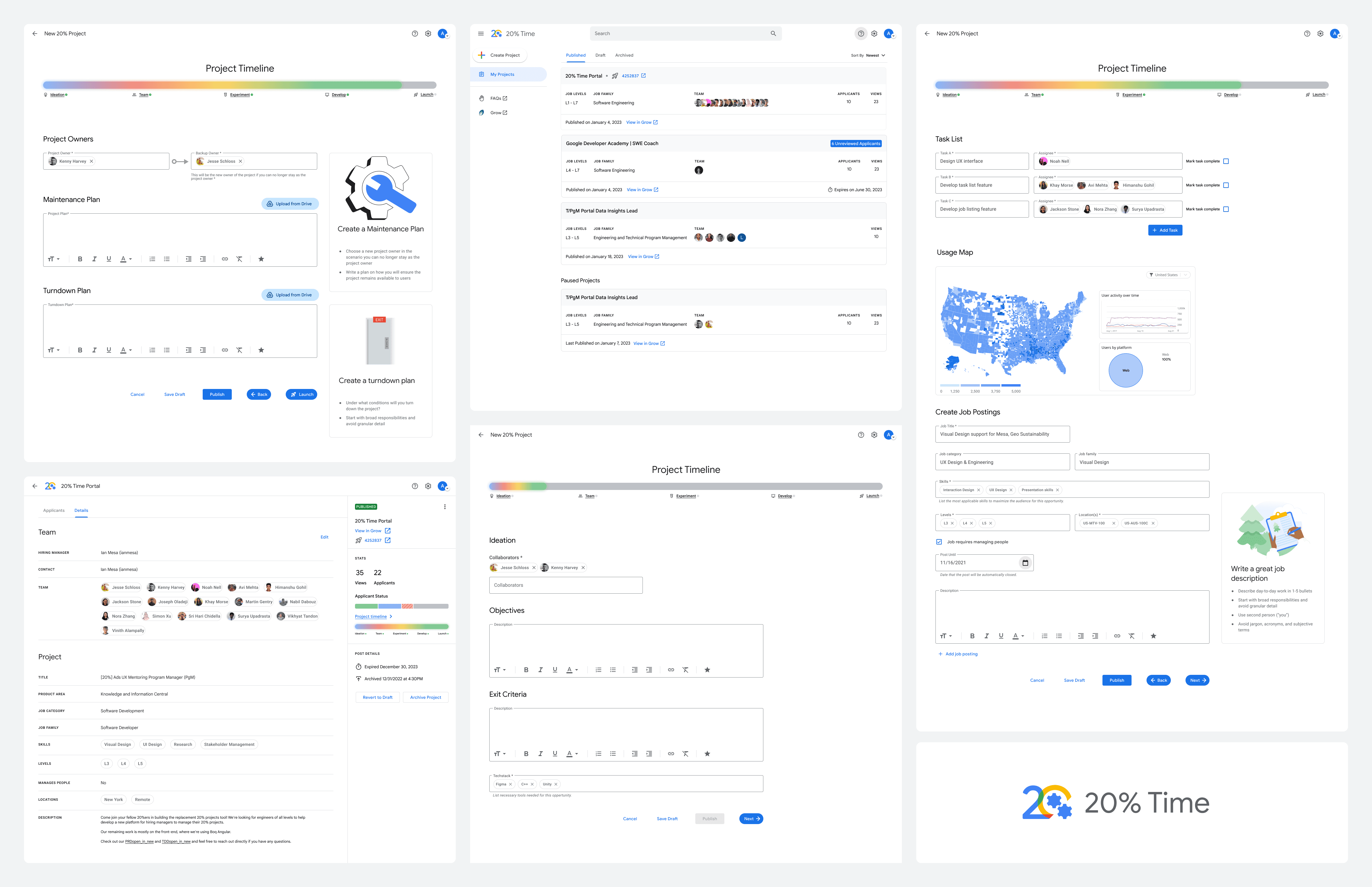
Sitemap: Making sure not to overcomplicate project management was a primary concern as I needed to have a way of creating a 20% position, assigning owners, adding team members, gathering analytics, create listings, launching, and etc. all in one place without being overwhelming to the user. My goal was to make the management process more engaging and visual with the user.
Digital Wireframes: Moving from site mapping to digital wireframes made it easy to understand how the redesign could help address user pain points and improve the user experience. Prioritizing walking the user through their project was my main strategy.
Low-Fidelity Prototype: To create a low-fidelity prototype, I connected all of the screens involved in the primary user flow of creating and managing your project. With each project phase placed on a timeline in order to show the user where their project is currently at and how far they are from launch, from there users can go back to where they resumed or backtrack to a previous project phase.
High-Fidelity Prototype: Created a high-fidelity prototype using the findings of my first usability study that was based off wireframes and the low-fidelity prototype. I used this high-fidelity prototype to conduct the second usability study in order to find any accessibility issues, solidify the UI, and adjust any mockups.
Usability Study Findings: I conducted several rounds of unmoderated usability studies. Findings from the first few studies helped guide the designs from wireframes to mockups. The second study used a high-fidelity prototype and revealed what aspects of the mockups needed refining and additional information.
Round 1 Findings:
Users overall liked the layout of the website as it share's a similar layout and look to Google's existing products and internal tools
Some users struggled to know which phase they were at on the project timeline
Users wanted easy access to their project after it launched
Round 2 Findings:
With high fidelity, users weren't confused on what phase they were at on the project timeline, rather they were confused on whether each step was required to be completed in order to move forward on the timeline.
Gradients that were animated were difficult for those with color blindness to see properly
Resuming progress on a project was difficult for some users to figure out
Refining the Design
Mockups: Based on the insights from the usability studies, I made changes to improve the user experience by making the link to the project timeline more obvious. This helps the user continue where they left off in their project or refer back to a previous phase to add a new posting, assign team members, etc.
The second usability study revealed that users where confused about whether or not they had to complete each step within a phase to move along the project timeline. To fix this I removed checks from the different project phases and pivoted to using buttons instead. This made it more clear that these where just sections of the project and the timeline is just a reference point to show how far a long you are until launch. I also updated colors and had animations stop on the timeline when the progress bar was not in motion to better accommodate those with color blindness.
Additional Mockups
As I learned from the second usability study, that there needed to be additional accessibility needs met, as Google has a large diverse fleet of employees who would either manage or would be part of a 20% role. I created an accessibility menu that can be accessed through the site settings. This allows users to switch between light and dark modes, reduce any site animations, and define call to action areas.
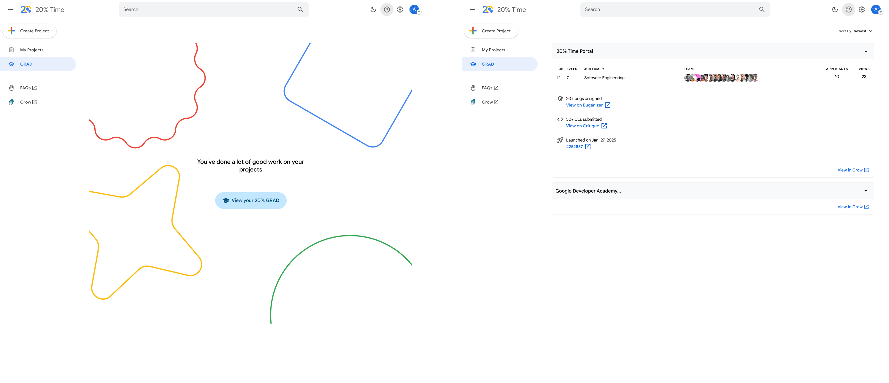
We also found that in. general users had trouble gathering all of their resources when it was time for them to apply for a role promotion, aside from just 20% work. In order to make this process easier for managers but also participants in a 20% project, I created a new option in site's main screen that gathers all work an individual has done on a said project, almost acting like a Spotify Wrap, but for work.