Navigation at a Glance
Redesign and optimization of a corporate intranet to enhance usability, improve internal communication, and boost employee engagement. The project aimed to create a more interactive and user-friendly platform for employees to access company resources and collaborate effectively.
The Product
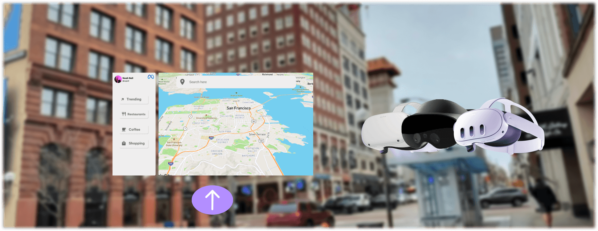
Meta Maps is a conceptual design project I worked on envisioning what it would be like if Meta made a product similar to Google Maps or Apple Maps. The product runs on Quest headsets via mixed reality/augmented reality
My Role
Lead UX designer designing the Meta Maps application from conception to delivery
Project Duration
Dec. 2022 - Oct. 2023
Platform
Spatial Computing
Challenge
Many people rely off their phone for navigation, especially for walking directions in urban environments. This can cause many distractions since users would be looking away from where they’re moving and instead looking towards their device, with mixed reality, you get to do both.
The Goal
Design an app that allows users to easily navigate their community without getting too distracted from where they’re walking.
Responsibilities
Research & Analysis: We conducted user interviews, surveys, and analyzed in-app analytics to understand the pain points and user needs. We also studied competitor apps and industry trends to gather insights
Information Architecture: Based on the research findings, we restructured the app's navigation and content, prioritizing features and information according to user needs.
Wireframing & Prototyping: We designed low-fidelity wireframes to visualize the new layout and navigation, iteratively refining them based on user feedback. Afterward, we built a high-fidelity, interactive prototype to test the design.
Usability Testing: We conducted usability tests with a diverse group of users to validate the design and identify areas for improvement. Based on the feedback, we made necessary adjustments to the design.
Visual Design & Style Guide: We developed a cohesive visual language, including color schemes, typography, and iconography, ensuring consistency throughout the app. We also created a style guide to maintain design consistency in future updates.


Understanding the User
Summary: I created storyboards, which I then turned into personas and empathy maps to better understand the target user and their needs. I discovered that many target users become distracted when using their devices for navigation or become confused on where they need to turn when getting walking directions. Even if an application does have augmented reality features to help navigation, users are still paying closer attention to their devices rather than where they’re walking.
Pain Point 1: Navigating on-foot using smartphones/tablets can be very distracting and dangerous.
Pain Point 2: Turn by turn directions on-foot can be difficult to navigate when going down side-streets, alleys, etc.
Pain Point 3: Augmented reality features on navigation apps still require you to shift your attention away from where you’re walking
Pain Point 4: There typically needs to be a separate companion app for a vehicle that you own vs a vehicle that you rent
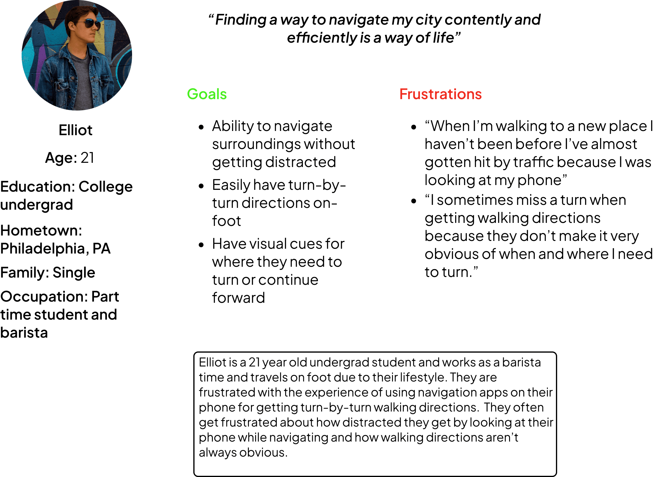
Persona: Elliot
Problem Statement: Eliot is a 21 year old part time student a barista. They rely off their phone to navigate their community, especially since they live in an urban environment. They mostly commute on foot and rarely drives.
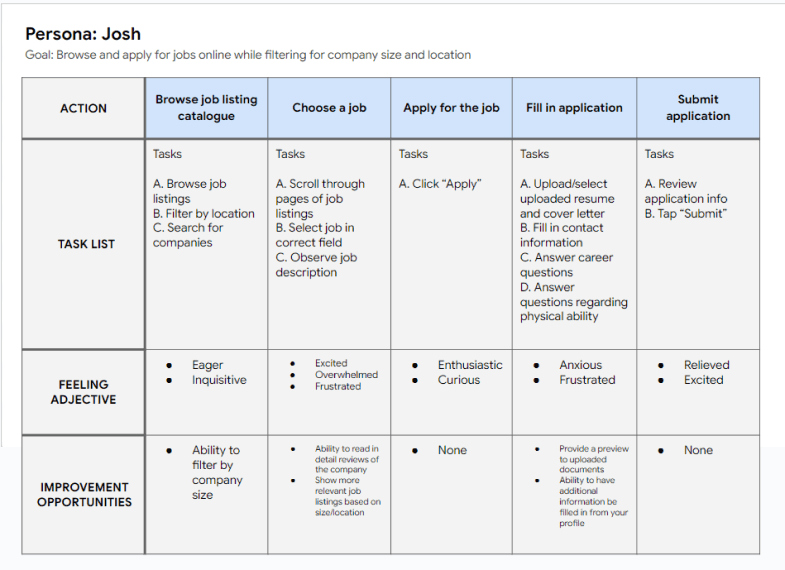
User Journey Map
Mapping Josh’s user journey revealed how helpful it would be to show a user reviews of a company before applying. This would cause the user to be more confident in applying and feel more at ease.
Starting the Design
FOV & Resolution: Difficulty with app visibility was a big concern for me, because when designing an app for spatial computing the first thing you need to take an account for is the users FOV (field of view) and display resolution. I say this because with so many headsets ranging in all sorts of FOVs and screen resolutions, you need to design something that universally fits all shapes and sizes of FOV and resolution so that way the user doesn’t have to squint or turn their head too much in order to use your app. To avoid this issue I stuck with VR guidelines from Google and Meta (previously Oculus).
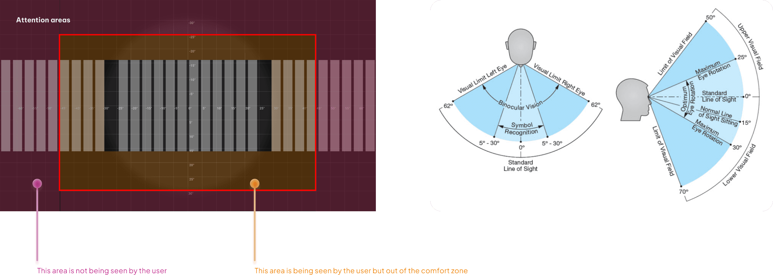
Source: Google
Source: Meta
Conclusion
Optimizing the corporate intranet significantly improved usability and employee engagement. By creating a more intuitive and interactive platform, we enhanced internal communication and collaboration, leading to a more connected and productive workforce. This project highlights the importance of user-centered design in improving organizational tools and employee satisfaction.