Designing Transportation for the Future
Complete overhaul of a e-bike companion app that allows users to manage their bike, view rides, get directions, and explore.
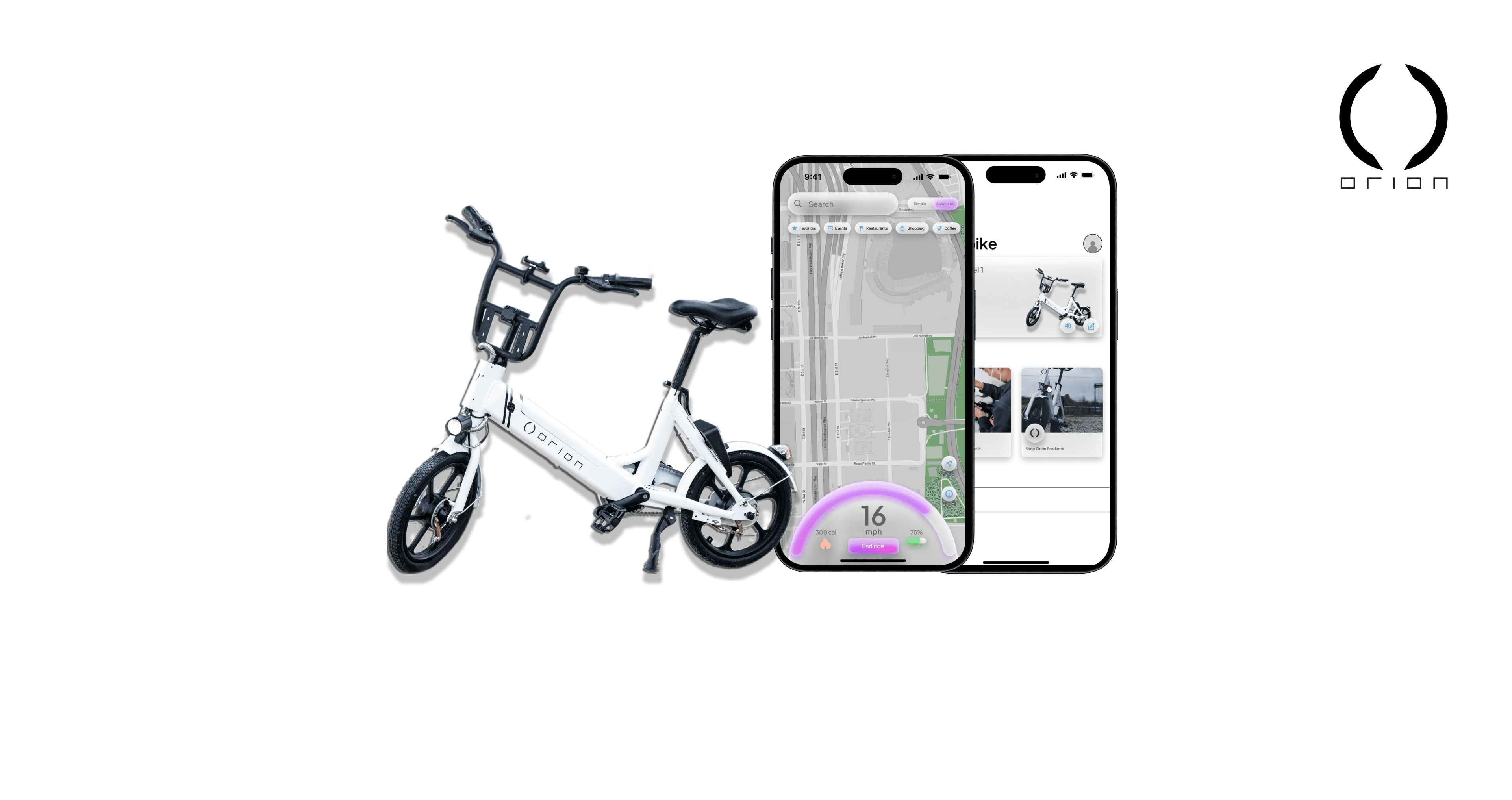
The Product
OrionGo is a companion app for the Orion e-bike. The app allows users to find bikes, manage their own bikes, view ride history, get directions, and view additional information such as bike speed and location.
My Role
UX designer designing the OrionGo app from conception to delivery
Project Duration
Jul. 2023 - Dec. 2023
Challenge
The Orion e-bike is a brand new product starting from the ground up. Orion needs an accessible app for users to control/manage their bikes. The previous app was not accessible and did not follow design guidelines.
The Goal
Design an app that allows users to easily control/manage their Orion e-bike while allowing room for additional features in future updates.
Responsibilities
Research & Analysis: We conducted user interviews, surveys, and analyzed in-app analytics to understand the pain points and user needs. We also studied competitor apps and industry trends to gather insights
Information Architecture: Based on the research findings, we restructured the app's navigation and content, prioritizing features and information according to user needs.
Wireframing & Prototyping: Designed low-fidelity wireframes to visualize the new layout and navigation, iteratively refining them based on user feedback. Afterward, we built a high-fidelity, interactive prototype to test the design.
Usability Testing: Conducted usability tests with a diverse group of users to validate the design and identify areas for improvement. Based on the feedback, we made necessary adjustments to the design.
Visual Design & Style Guide: Developed a cohesive visual language, including color schemes, typography, and iconography, ensuring consistency throughout the app. We also created a style guide to maintain design consistency in future updates.
Understanding the User
Summary: I conducted user interviews, which I then turned into personas and empathy maps to better understand the target user and their needs. I discovered that many target users at times get confused with similar companion apps such as Lime or Bird, this becomes especially stressful for the user when they are in a rush. Many of the target users also didn’t find much of a reason to keep these companion apps on their phone since they only use them when they need them, our main goal is to find a way to keep our target users engaged and to consistently use our companion app; OrionGo.
Pain Point 1: Finding how to get started riding can at times, be confusing
Pain Point 2: App never stays on the phone because it takes up space and is only used for when it’s needed
Pain Point 3: Many of these companion apps look outdated and follow design trends from 10 years ago
Pain Point 4: There typically needs to be a separate companion app for a vehicle that you own vs a vehicle that you rent
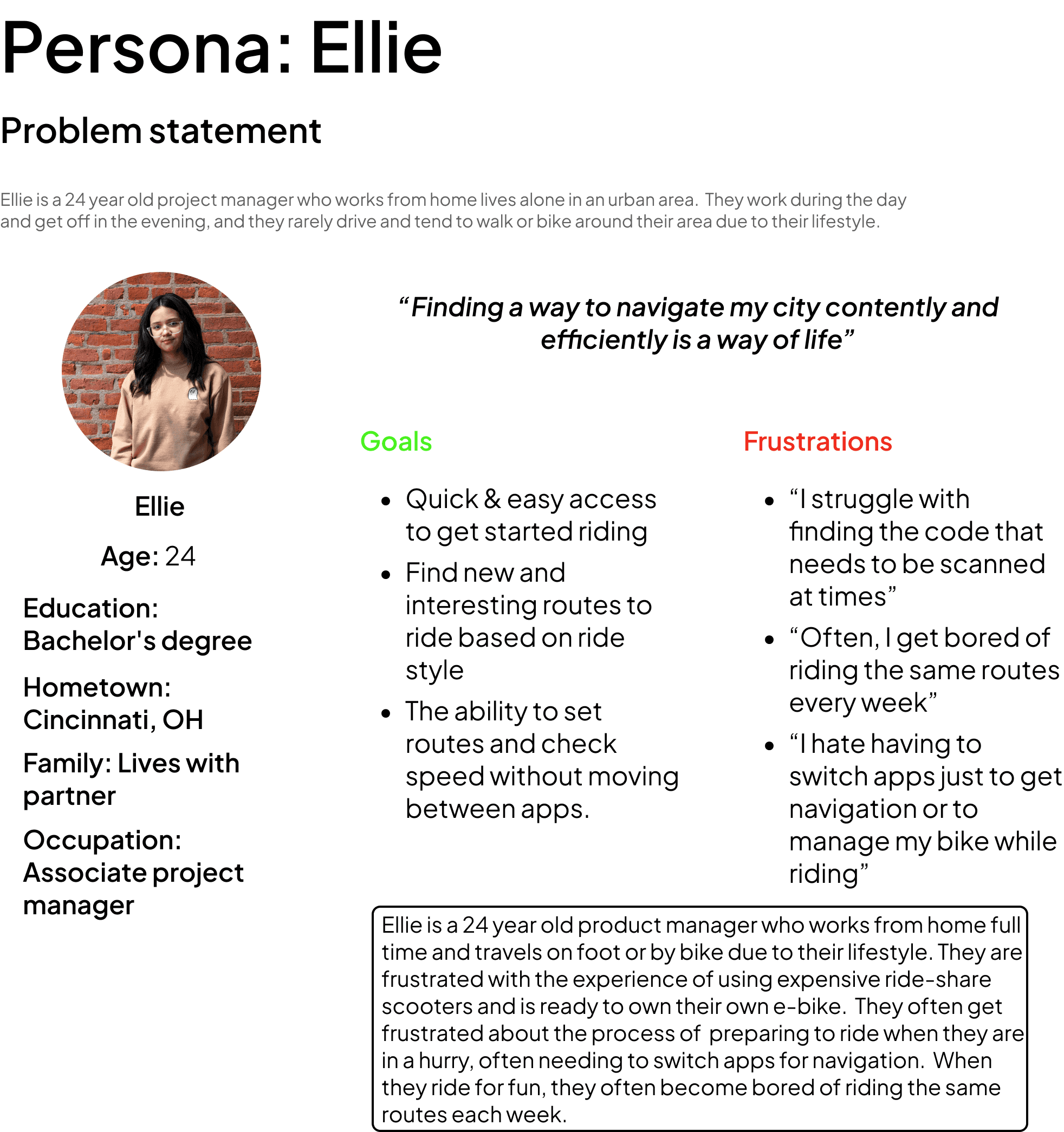
Persona: Ellie
Problem Statement: Ellie is a 24 year old project manager who works from home lives alone in an urban area. They work during the day and get off in the evening, and they rarely drive and tend to walk or bike around their area due to their lifestyle.
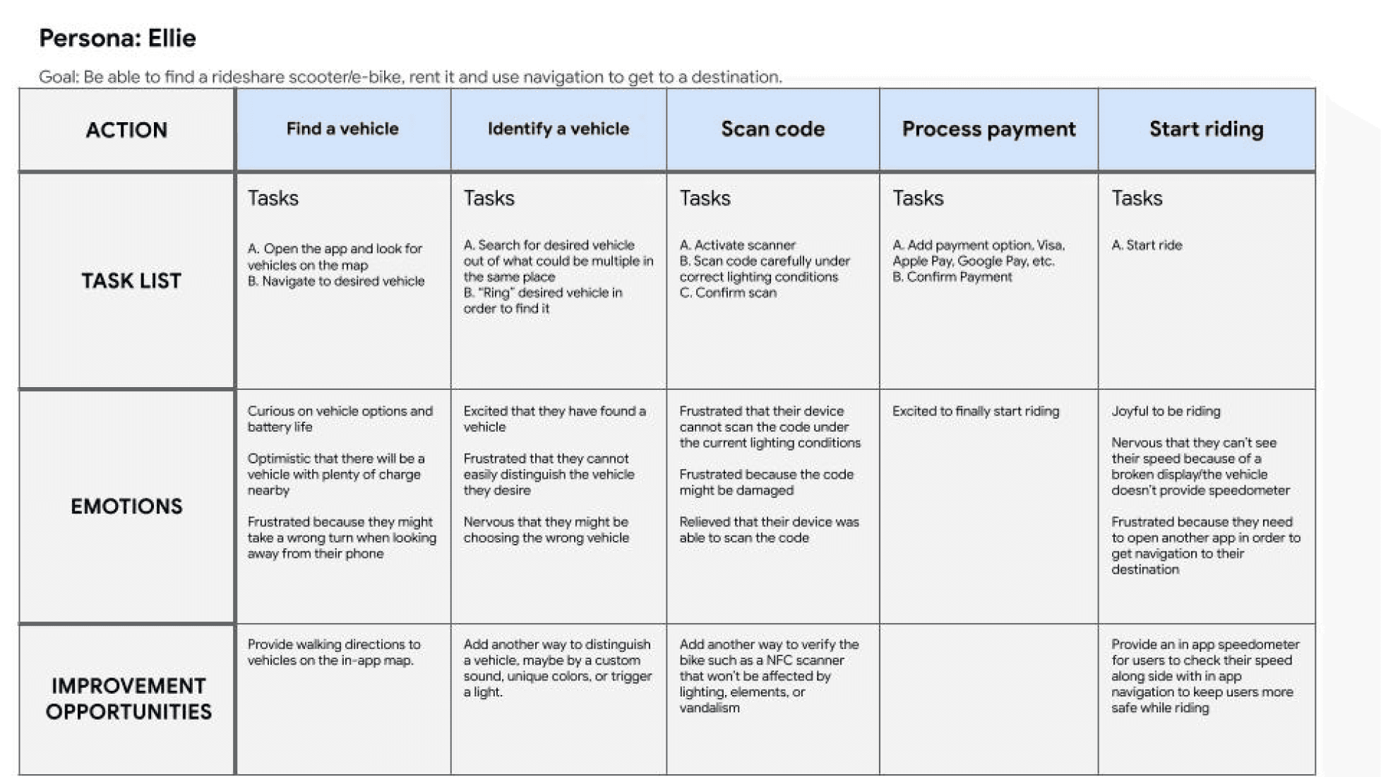
User Journey Map
Mapping Ellie’s user journey revealed how giving users the ability to check their speed and set routes in the app can prove to be easier but also safer while riding.
Starting the Design
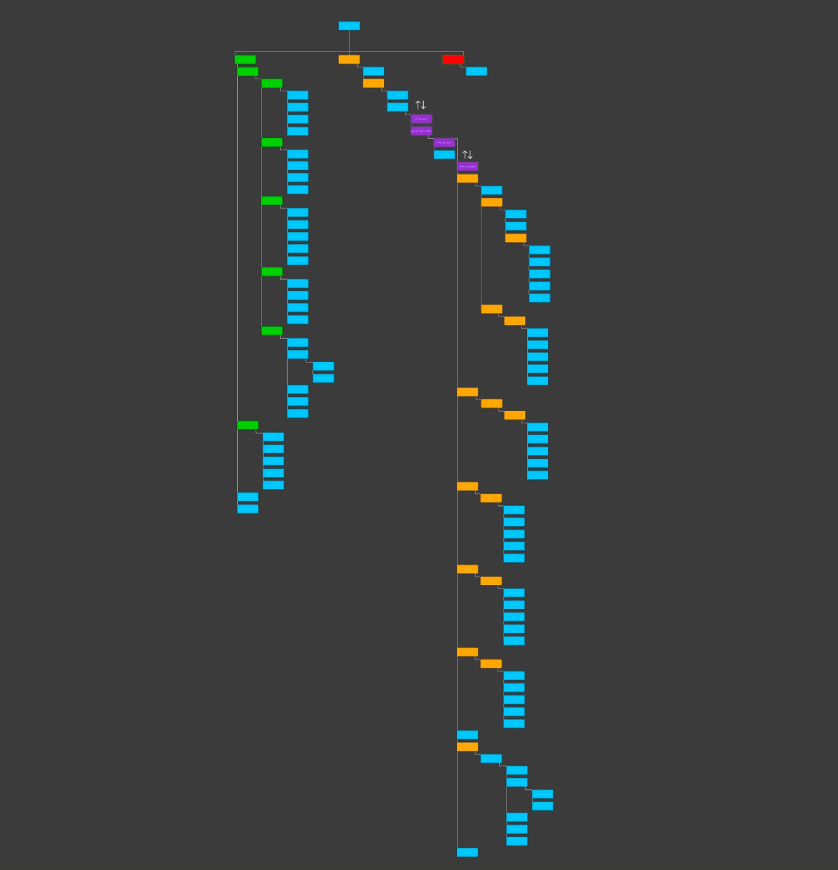
Sitemap: Difficulty with app navigation was a primary concern as I needed to add the ability for a speedometer and navigation within one screen without being overwhelming or too distracting to the rider, so I used that concern to create a site map. My goal here was to make it easy with finding information within the app and keep the rider’s eyes on the road while operating the vehicle.
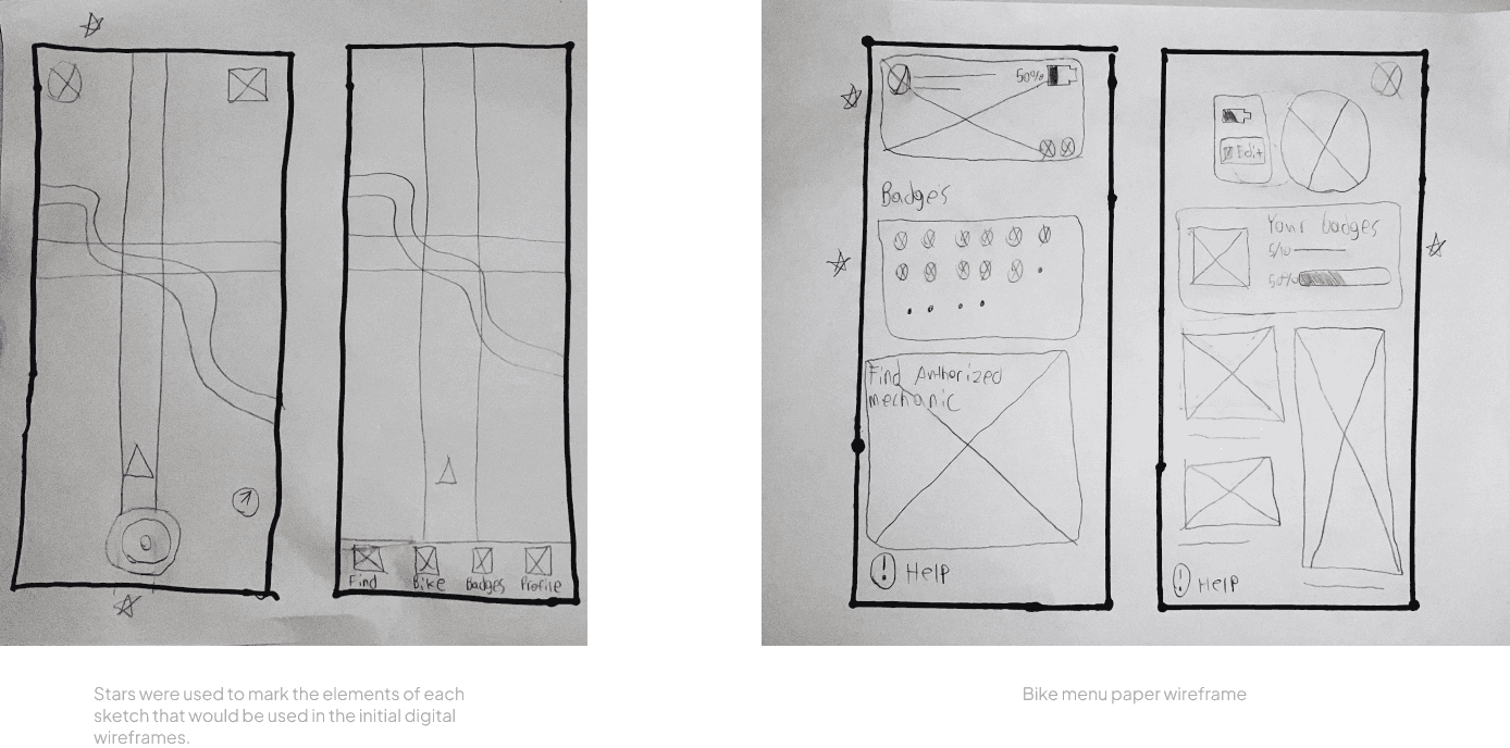
PaperWireframes: Next, I sketched out paper wireframes for each screen of the OrionGO app, keeping the user pain points about navigation, scanning, and safety in mind. The home screen paper wireframe variations bellow focus on optimizing vehicle discovery and “TTR” (Time To Ride). While the bike menu wireframes prioritize bike management, customizability, and support.
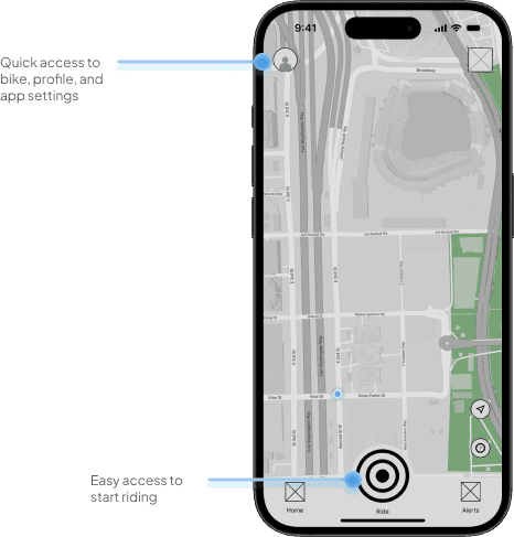
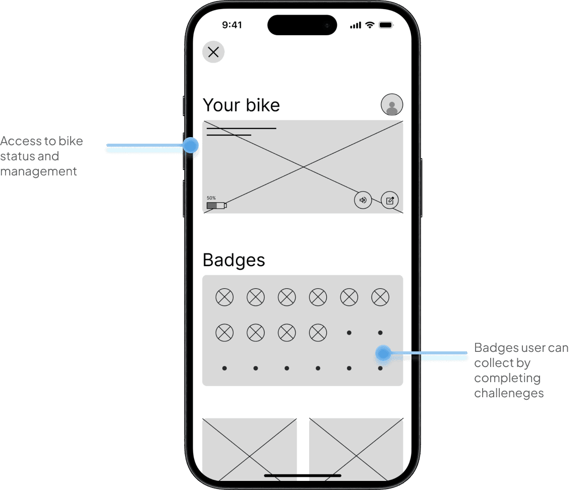
Digital Wireframes: Moving from paper to digital wireframes made it easy to understand how the redesign could help address user pain points and improve the user experience. Prioritizing quick access to riding and easy accessibility to help/support was my key strategy.
Mobile wireframes were moved from paper to digital as well
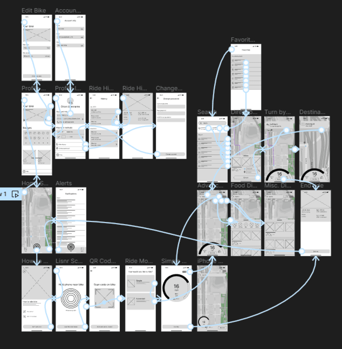
Low-Fidelity Prototype: To create a low-fidelity prototype, I connected all of the screens involved in the primary user flow of connecting to a bike, starting a ride, using navigation, and managing your bike and app settings. At this point, I had received feedback on my designs about things like placement of buttons, icons, and meters. I made sure to listen to their feedback, and I implemented several suggestions in places that addressed user pain points
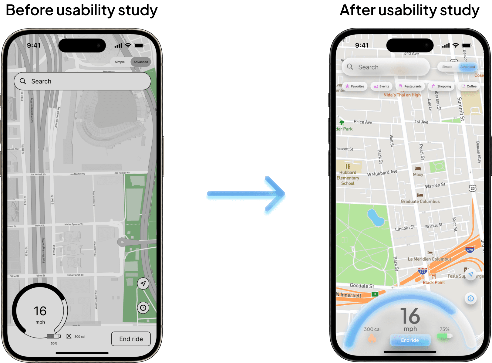
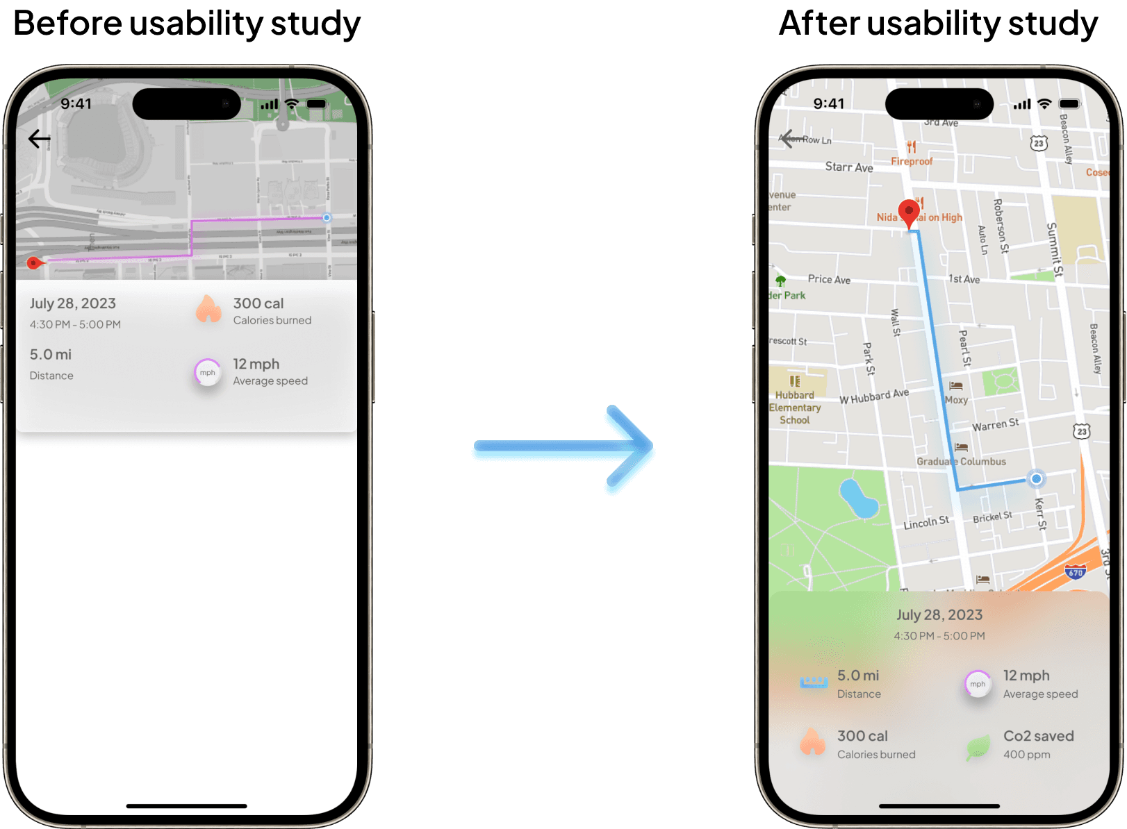
Usability Study Findings: I conducted several rounds of unmoderated usability studies. Findings from the first few studies helped guide the designs from wireframes to mockups. The second study used a high-fidelity prototype and revealed what aspects of the mockups needed refining and additional information.
Round 1 Findings:
Users struggled to see their speed on the original design especially while riding
Users were frustrated that they couldn’t switch between ride modes while already riding
Users wanted the ability to toggle to either a light or a dark mode
Round 2 Findings:
Users wanted to access additional information such as distance, calories burned, C02 levels, etc. when viewing previous rides
Many users especially ones with eye conditions preferred an alternate color scheme
Refining the Design
Mockups: Based on the insights from the usability study, I made changes to improve the riders visibility while using navigation. By making the speedometer take up the bottom width of the screen allows for better visibility of speed, battery life, and calorie burn. This causes the placement of the on-screen speedometer to be very similar to the placement of many two wheeled motor vehicles.
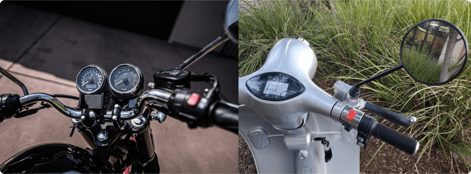
Examples of speedometer placement on two wheeled motor vehicles
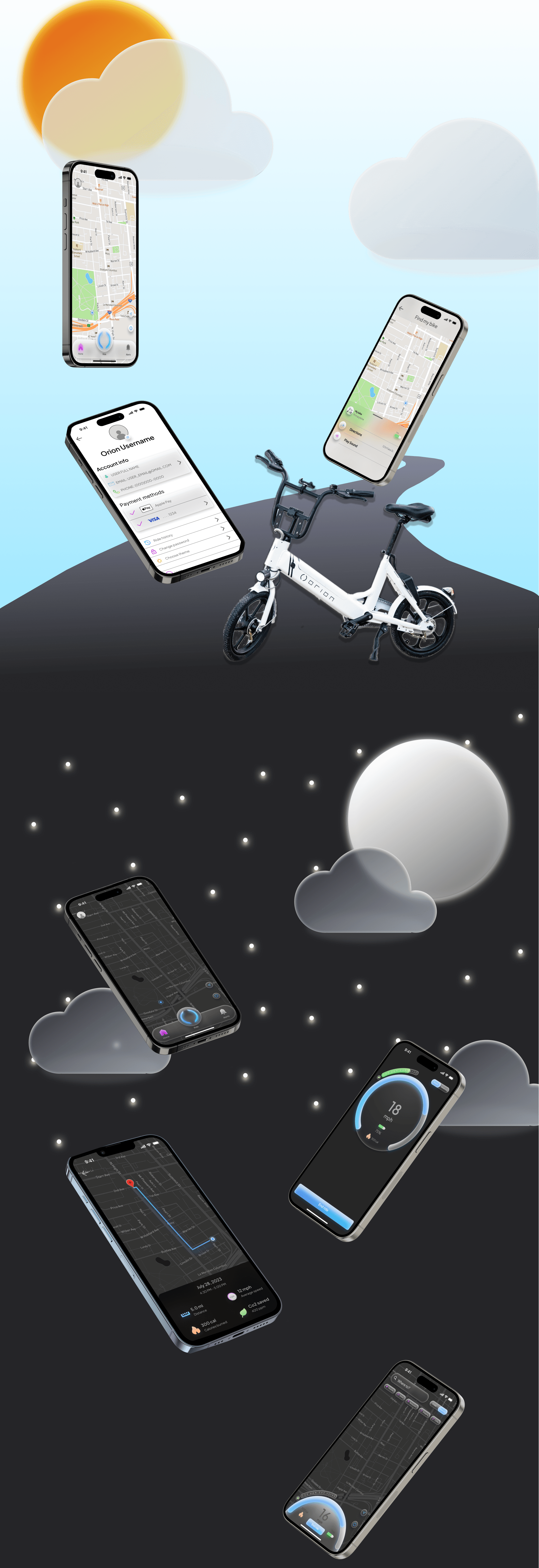
The second usability study revealed that users expected to see more information about their previous rides. To fix this issue I added more information about each ride such as distance traveled and C02 that was saved in comparison to driving a car. I also increased the size of the map to take up the entire screen so users can better see their route.
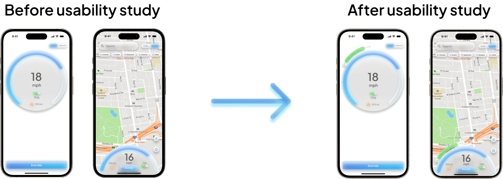
To better reward the user on their commitment to cleaner transportation, I added an additional meter that sits just above the on-screen speedometer for both “simple” and “advanced” modes. Users are met with a goal of how much Co2 to save while riding, the more the meter fills the closer they get to their goal. Once the user meets their goal, the meter greets the user with a splash a green to prompt to the user they have hit their goal and earned a badge. After this a new goal is set.
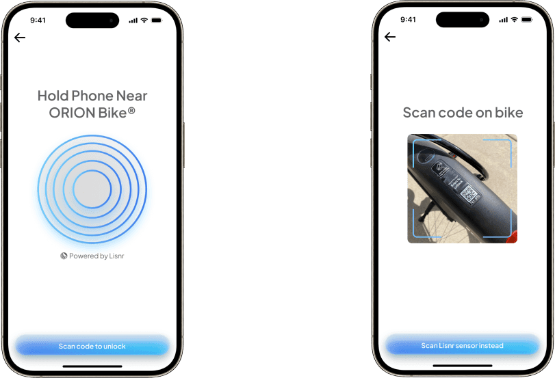
Orion bikes were also outfitted with Lisnr NFC sensors to help users better connect their bikes to the OrionGo app. QR code scanner was still added for accessibility.
Additional Mockups
High-Fidelity Prototype: My hi-fi prototype followed the same user flow as the lo-fi prototype, and included the design changes made after the usability studies, as well as several changes suggested by members of my team. Multiple prototypes were created in order to determine the final color scheme that would be most accessible.
Accessibility Considerations:
Designed both a light and dark mode version of the appI offered the option for users yo search with voice to help users navigate around the site
Used iconography with contrasting colors to better associate toggles to their function
Ride modes use a “skewmorphic” approach to minimize distraction while riding
Going Forward
Takeaways
Impact:
Our target users shared that the design was easy and intuitive to navigate through. Users stated that the refreshed design both looked aesthetically better and was easier to use than the original design.
One quote from peer feedback:
“This is a huge improvement for the app! I am able to easily ride and manage my bike while still looking high-end.”
What I Learned:
I learned that when designing for a product that is in movement while in traffic, you need to consider many factors. These factors include how much should the user be able to interact with the app while riding? What’s considered too much information while riding? etc. I also considered accessibility more than ever by making it easy for users to manage their bike, get support, and contact emergency services.
Next Steps:
Identify any additional areas of need and ideate on new features
Ideate on new in-app challenges for users to compete with
Conduct another usability study to validate any additional pain points