Designing an open trust platform
Job board website designed to be as transparent as possible and to build trust with users to help with their job hunting proccess.
The Product
Salus is a job board site that provides transparency to applicants in the job market. The typical user is 18-55 years old, and most users are college graduates looking to start a career and early professionals.
My Role
UX designer designing the Salus website from conception to delivery
Project Duration
Sept. 2023 - Oct. 2023
Challenge
Available online job boards do not have a way of knowing specific information of a said company such as pay, behavior, culture, and reputation. This leads to many job seekers being taken advantage of and/or abused and harassed.
The Goal
Design a job board site that provides transparency by providing specific insights on companies by different criteria.
Responsibilities
Research & Analysis: We conducted user interviews, surveys, and analyzed in-app analytics to understand the pain points and user needs. We also studied competitor apps and industry trends to gather insights
Information Architecture: Based on the research findings, we restructured the app's navigation and content, prioritizing features and information according to user needs.
Wireframing & Prototyping: Designed low-fidelity wireframes to visualize the new layout and navigation, iteratively refining them based on user feedback. Afterward, we built a high-fidelity, interactive prototype to test the design.
Usability Testing: Conducted usability tests with a diverse group of users to validate the design and identify areas for improvement. Based on the feedback, we made necessary adjustments to the design.
Visual Design & Style Guide: Developed a cohesive visual language, including color schemes, typography, and iconography, ensuring consistency throughout the app. We also created a style guide to maintain design consistency in future updates.
Understanding the User
Summary: I conducted user interviews, which I then turned into empathy maps to better understand the target user and their needs. I discovered that many target users are stressed out a anxious about job searching. They find the process of job searching tedious and end up having a lot of spam hitting their inbox. They might also take an opportunity without knowing enough about a company and discover things about the position that they were not anticipating. This causes fear in users and in the future they may pass up some opportunities by not knowing enough about a said company and continue to be very anxious when trying to search for a new job.
This should not be the case!
Pain Point 1: Job boards can often be busy, which results in confusing navigation
Pain Point 2: Some job boards are better suited for desktop only which sometimes leads users to make mistakes and become frustrated when they are on mobile
Pain Point 3: Job boards always look very similar to each other without providing any new features that can provide better trust with users
Pain Point 4: Job boards often don’t go very deep with who a company is and what exactly is involved with them and their history
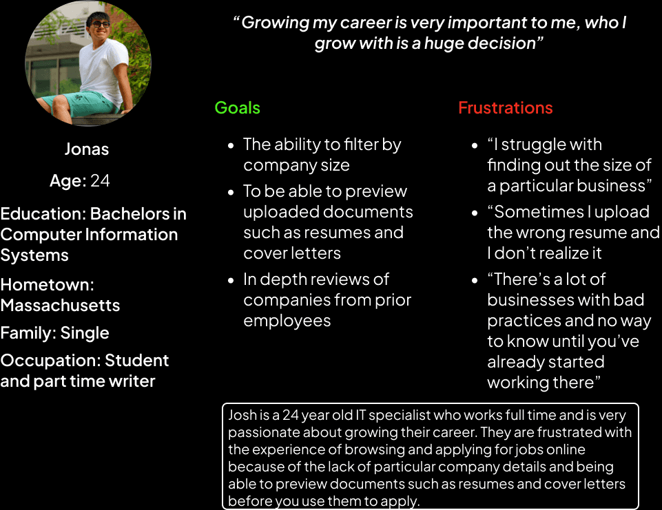
Persona: Josh
Problem Statement: Josh is a 24 year old IT specialist and recent graduate who lives with their partner. They work during the day and get off in the evening, and they occasionally browse through job listings online when they are available.
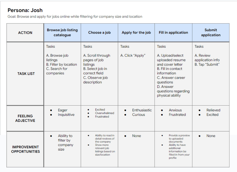
User Journey Map
Mapping Josh’s user journey revealed how helpful it would be to show a user reviews of a company before applying. This would cause the user to be more confident in applying and feel more at ease.
Starting the Design
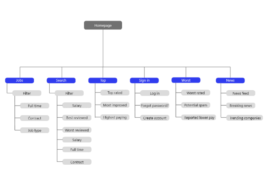
Sitemap: Difficulty with website navigation was a primary pain point for users, so I used that knowledge to create a site map.
My goal here was to make strategic information architecture decisions that would improve overall website navigation. The structure I chose was designed to make things simple, easy, and transparent.
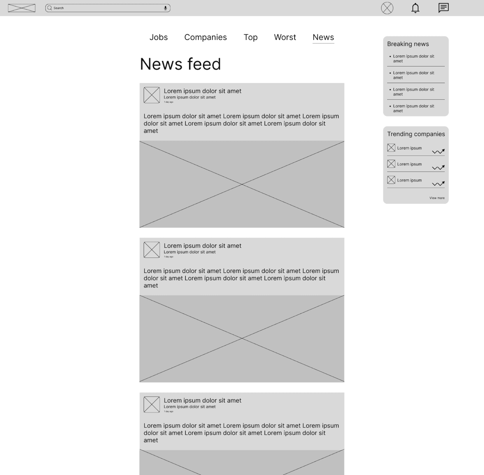
PaperWireframes: Next, I sketched out paper wireframes for each screen in my site, keeping the user pain points about navigation, browsing, applying in mind. The home screen paper wireframe variations bellow focus on optimizing the browsing experience for users
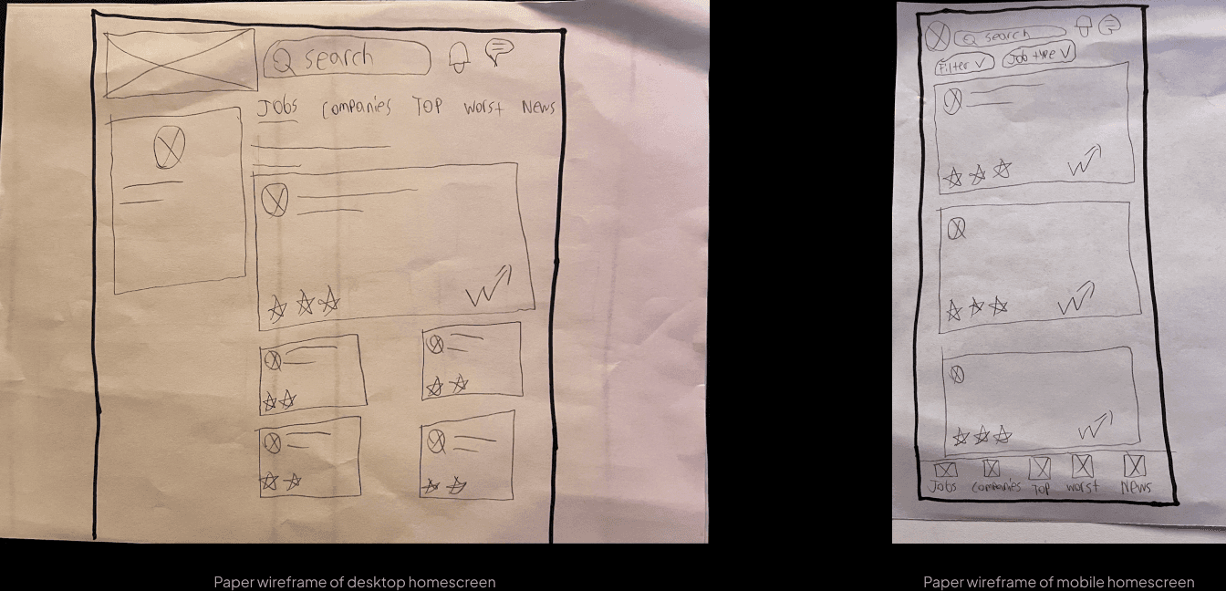
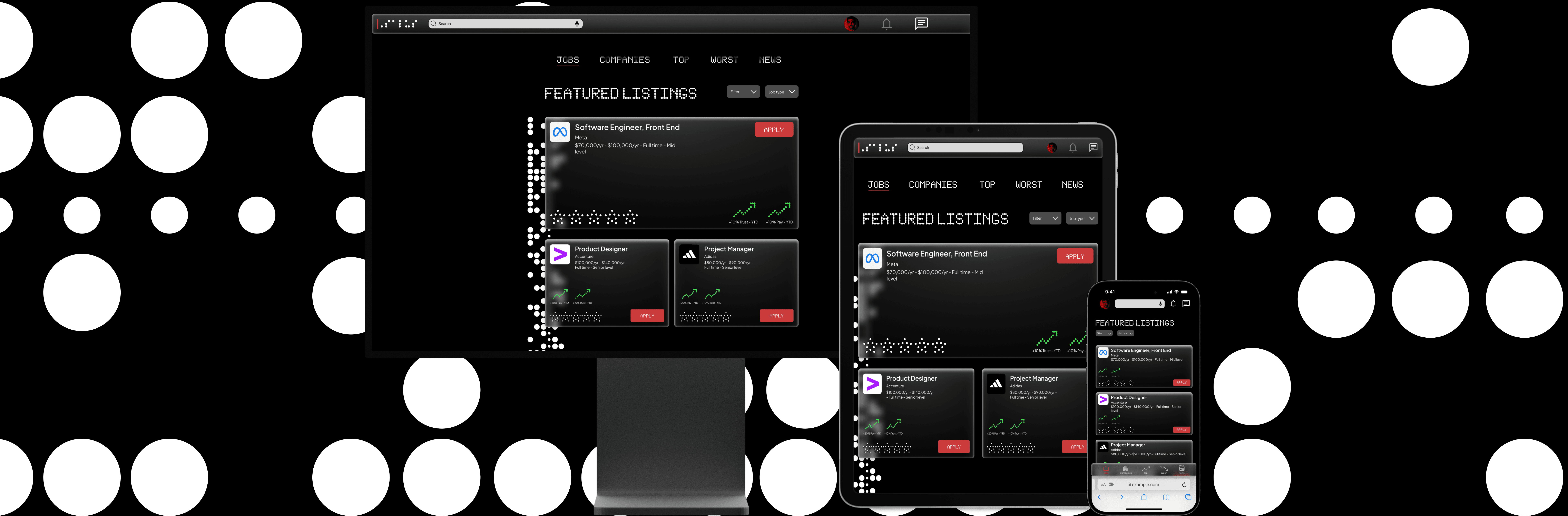
Because Salus users access the site on a variety of different devices, I started to work on designs for additional screen sizes to make sure the site would be fully responsive.
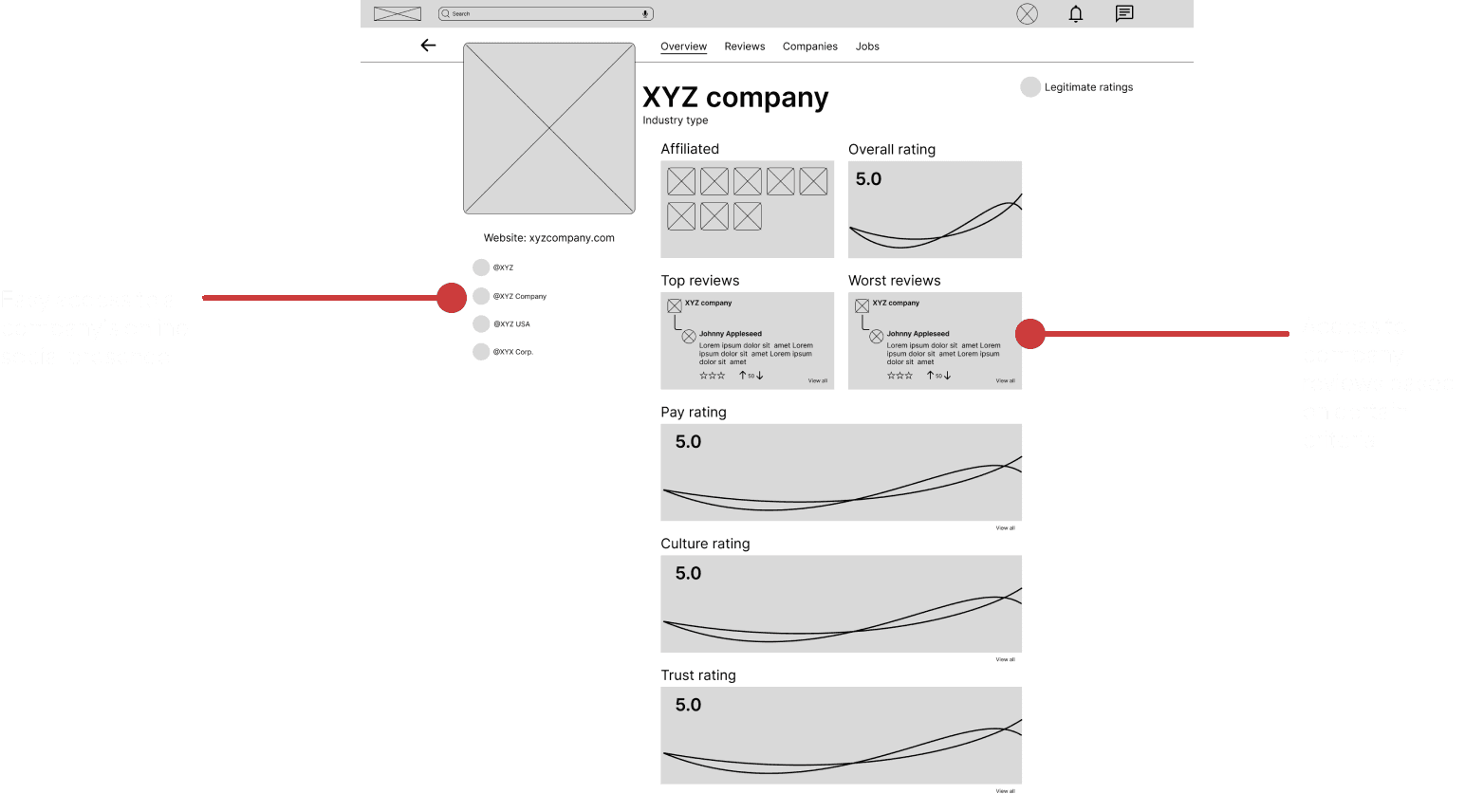
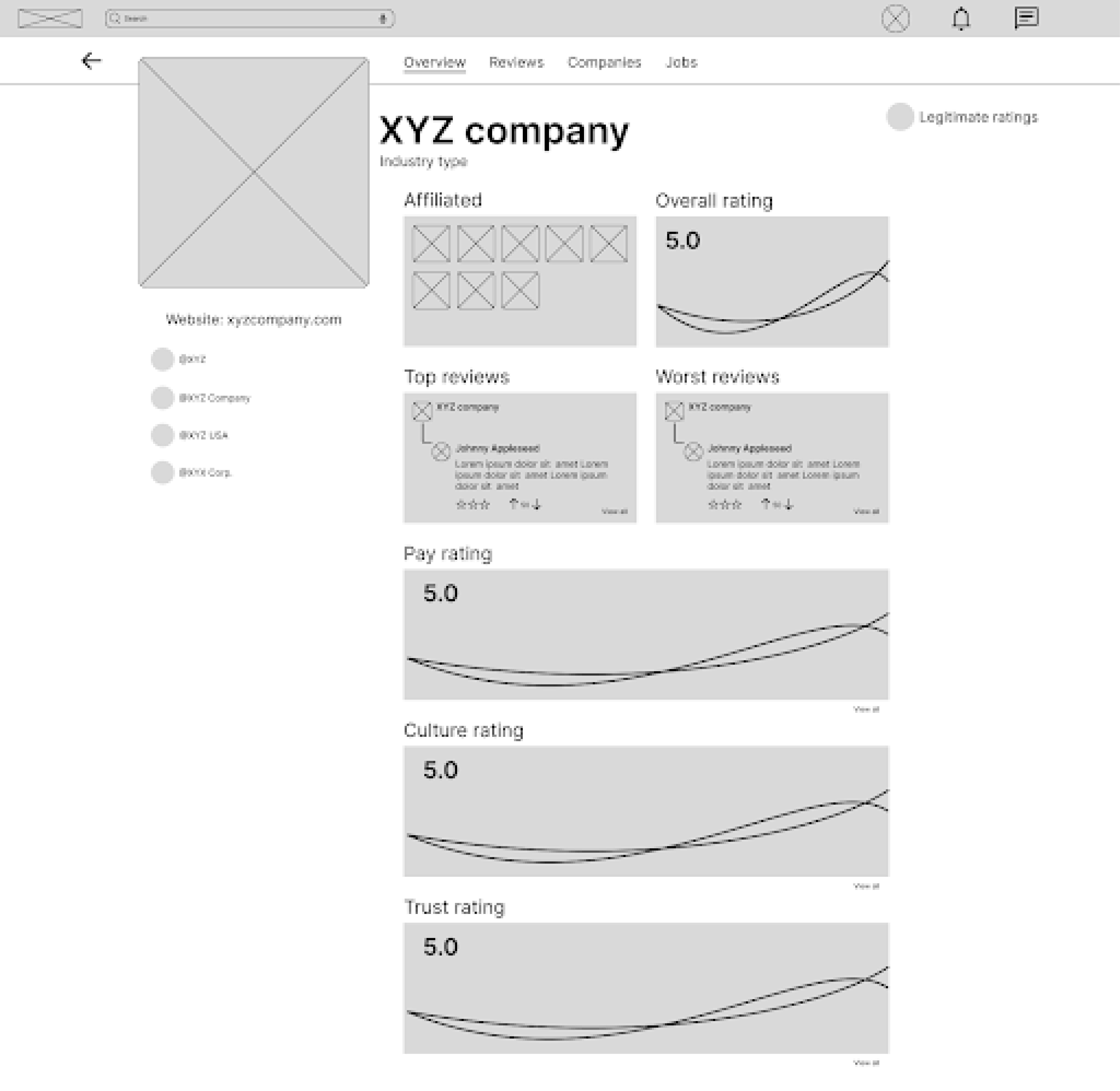
Digital Wireframes: Moving from paper to digital wireframes made it easy to understand how the redesign could help address user pain points and improve the user experience. Prioritizing visibility of company statistics on elements was a key part of my strategy.
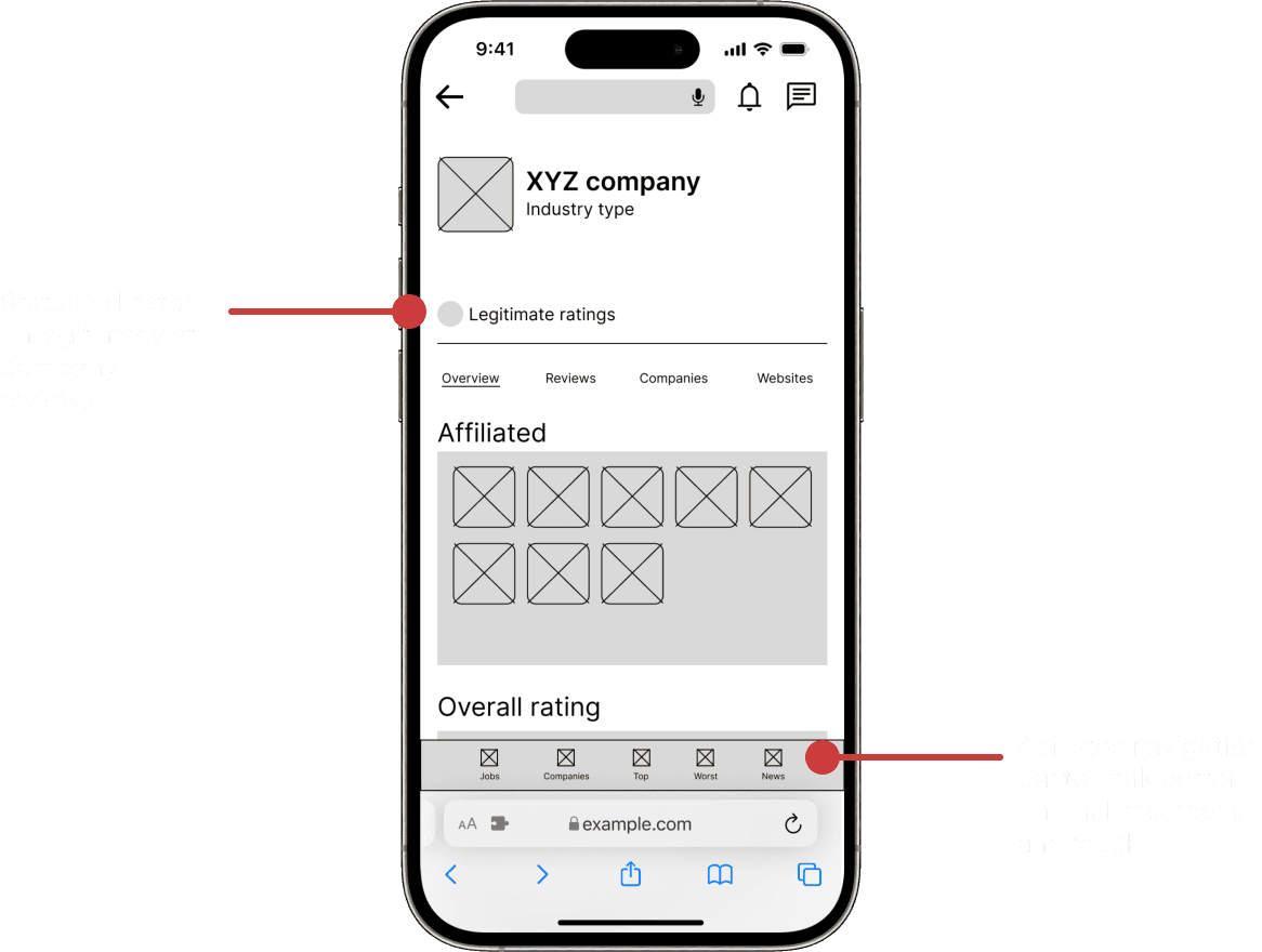
Mobile wireframes were moved from paper to digital as well
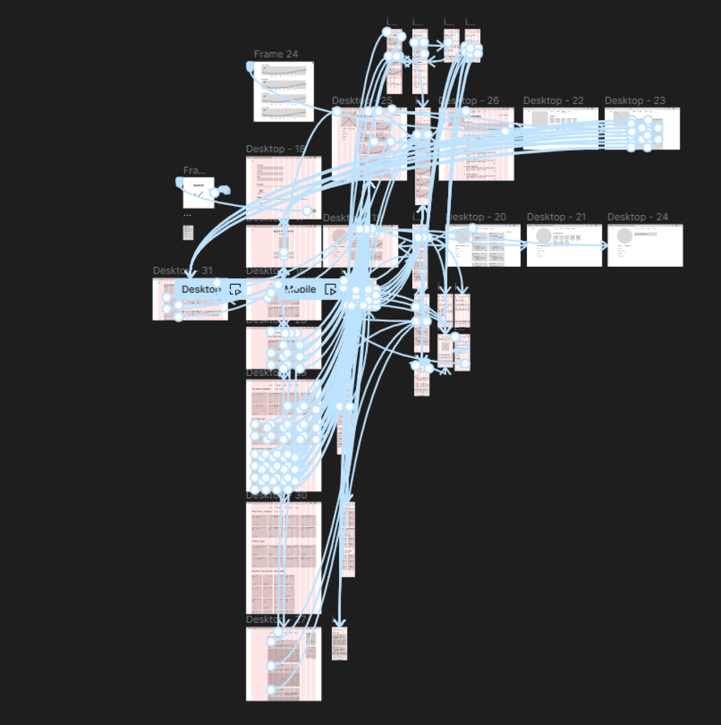
Low-Fidelity Prototype: To create a low-fidelity prototype, I connected all of the screens involved in the primary user flow of browsing positions and applying for a job. At this point, I had received feedback on my designs about things like placement of buttons and page organization. I made sure to listen to their feedback, and I implemented several suggestions in places that addressed user pain points
Usability Study Findings: I conducted two rounds of unmoderated usability studies. Findings from the first study helped guide the designs from wireframes to mockups. The second study used a high-fidelity prototype and revealed what aspects of the mockups needed refining.
Round 1 Findings:
Users struggled on where to click to view an application
Users wanted a role description page to know more about the position before applying
Users struggled to understand company ratings and were searching for a description of the ratings
Round 2 Findings:
Users didn’t like the placement of the profile tile, felt like it made the design feel more crowded
Users wanted to see more information on someone’s prior work history such as employment length and when they worked at a particular company.
Refining the Design
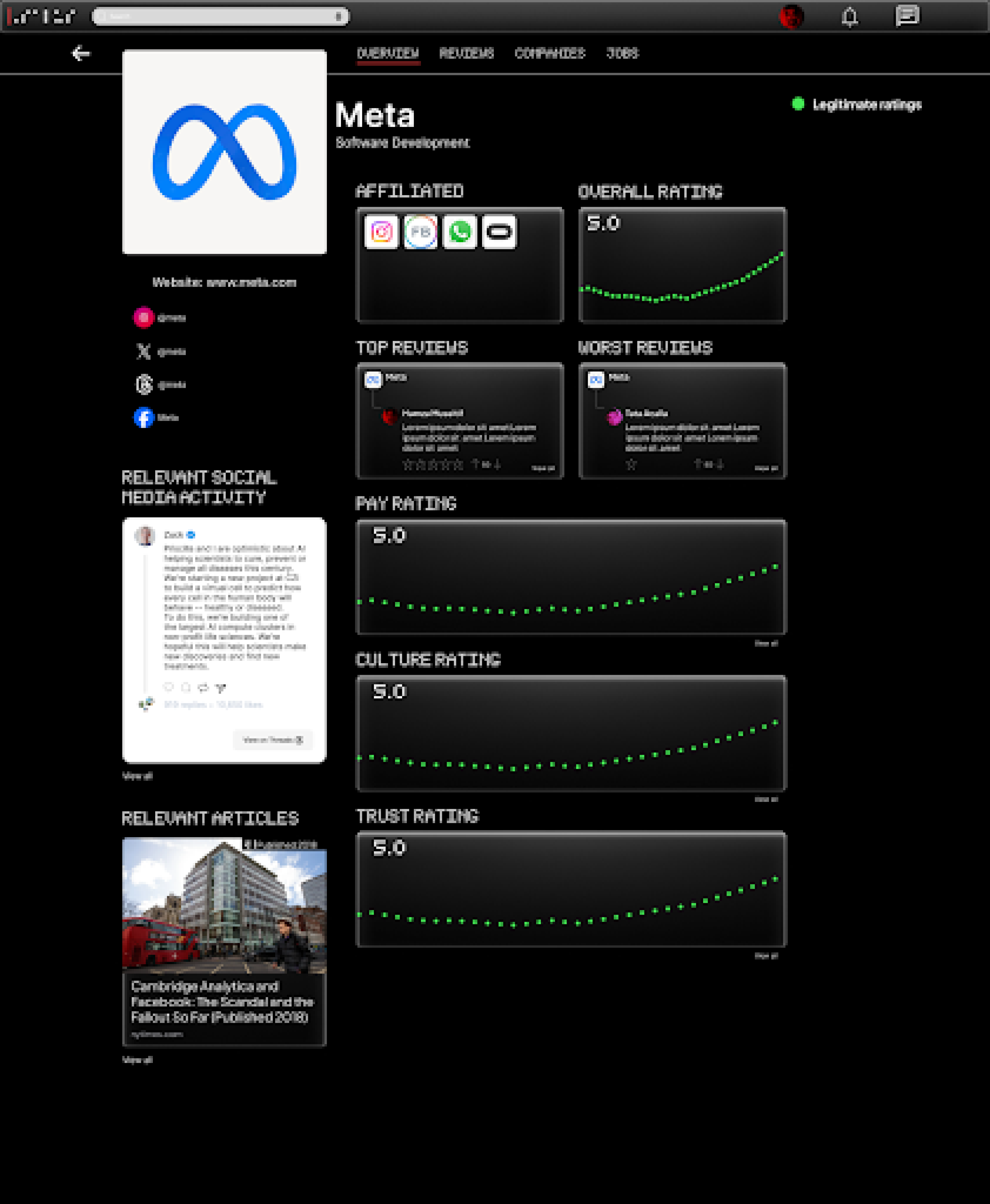
Mockups: Based on the insights from the usability study, I made changes to improve the sites clarity and transparency. One of the changes I made was adding relevant company ratings to articles in the news section. This allowed users to be more knowledgeable about what was going on with particular companies they might think about applying for. I also added headlines along with the accompany link to prevent misleading descriptions.
Before Usability Study
After Usability Study
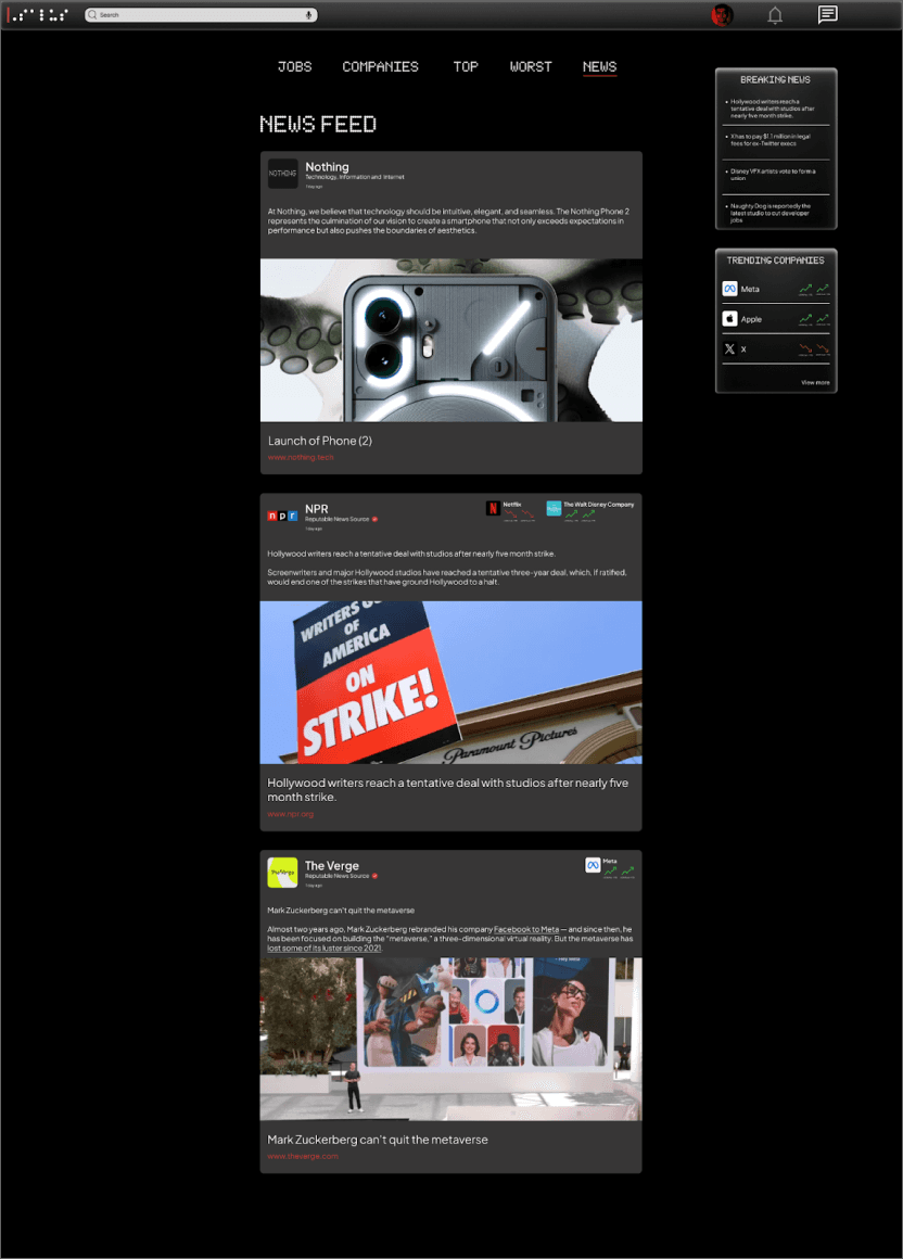
To make company ratings more readable, I decided to color code ratings based if they’re considered positive, moderate, or negative. Ratings charts are also scaled back to use only a single line chart instead of multiple. I also added a relevant social media presence from accounts that are associated with the said company. Relevant news articles regarding the company was also added to provide additional transparency for users.
Before Usability Study
After Usability Study
Additional Mockups
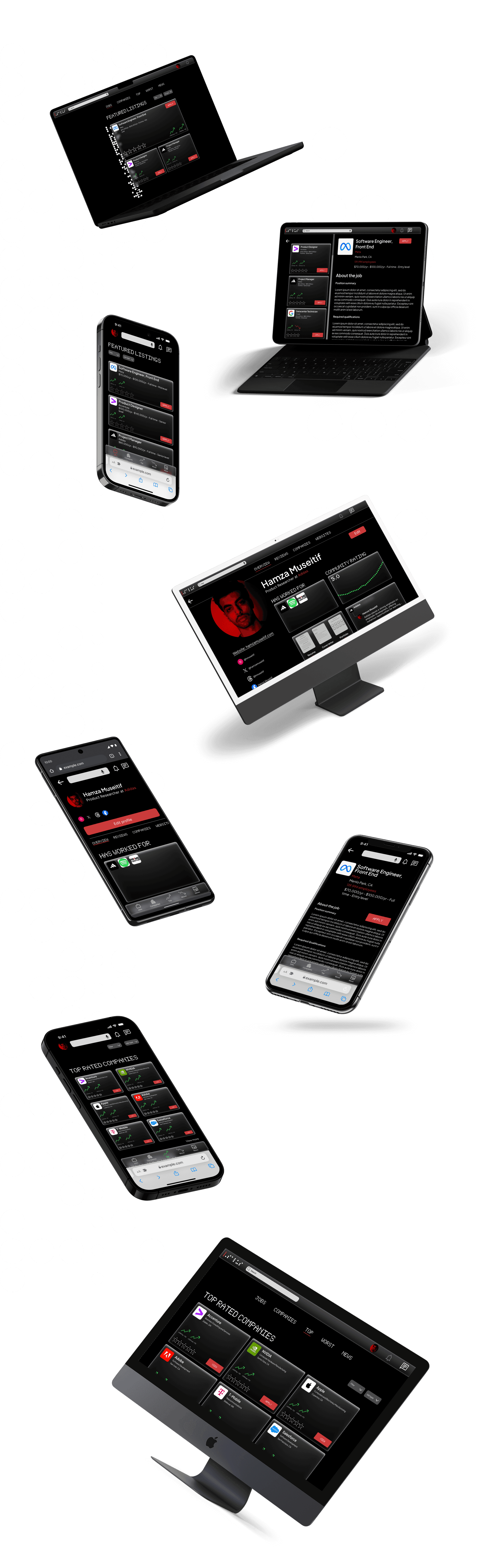
High-Fidelity Prototype: My hi-fi prototype followed the same user flow as the lo-fi prototype, and included the design changes made after the usability study, as well as several changes suggested by members of my team.
Accessibility Considerations:
I used headings with different sized text for clear visual hierarchy
I offered the option for users yo search with voice to help users navigate around the site
I used landmarks to help users navigate the site, including users who rely on assistive technologies.
Going Forward
Takeaways
Impact:
Our target users shared that the design was intuitive to navigate through, more engaging with visual cues such as graphs, animations, and images, and demonstrated a clear visual hierarchy.
One quote from peer feedback:
“This site made it really easy to find out more about companies I may want to apply to. Has me use the job market like the stock market!”
What I Learned:
I learned that even a small design change can have a huge impact on the user experience. And that when creating a responsive design you need to think about how each design choice will be reflected on different types of screens. The most important takeaway for me is to always focus on the accessibility and real needs of the user when coming up with design ideas and solutions.
Next Steps:
Conduct another round of usability studies to validate any additional user pain points
Identify any additional areas of need and ideate on new features
Design and develop a light mode for the website